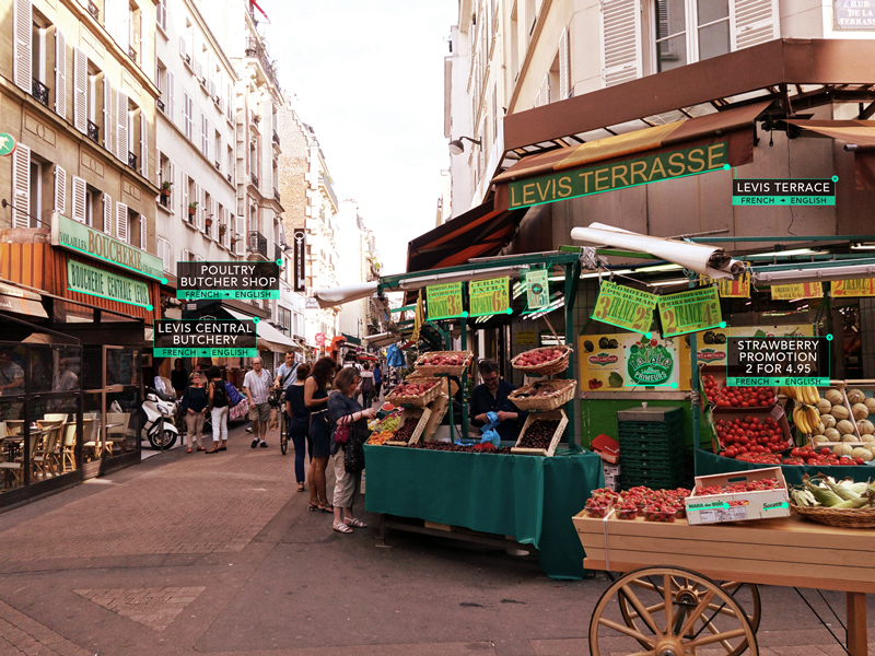
Day 012 - Augmented Translator
I kept the interface simple, but clear. The augmented overlay would highlight over an entire area of type. If there were words that seemed to be grouped together (on a sign for example), each line of type would have an underlying stroke for specific translation by word/line. By clicking on the highlighted area or underlined word, the user opens up the translation overlay with the translated word and translation languages. The user can then cancel those by clicking the "x" close button on the top right.
See more on my blog:
www.colinspencedesign.com/blog

