Day 023 - Wallet Expenses
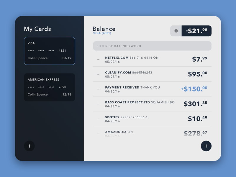
For this wallet widget, the elements all work nicely together in a clean and simple arrangement. The left field displays your various card options, while the right displays the appropriate information. The selected card is emphasized with a thin blue stroke around the card on the right, and the subtitle below "Balance" is updated to the corresponding card. The info button beside the balance would trigger an inline dropdown to display the user's account details (amount left, last payed, etc.). I wanted the filtering system to be as simple and flexible as possible, so the user would be able to input a date, a date range, or just sort by keywords, and the results would return instantly "as-you-type".
See more at www.colinspencedesign.com/blog

