Granify
UI Design
|
Web Design
|
Illustration
Granify is a SaaS solution that fits smack dab at the intersection of artificial intelligence and e-commerce. It enables online retailers to maximize their sales by using cutting edge big data and machine learning technologies. The software predicts specific user barriers, and offers solutions to those problems before the user leaves the site.
I was hired on to build the design team at Granify when it was just a small startup. I worked as the sole designer, while laying the ground work for future hires. I eventually hired and led a team of 4, contributing to a Series A funding of $9M from Valar Ventures in 2015. This was the largest tech investment in Alberta that year, and my team of designers and I had a large role, producing the public facing product. We worked with some of the largest brands in the world like HSN, Hollister, Toys R' Us, Hallmark and many others across the globe. In the first 3 months of 2017 alone, our work had led to over $21M in new sales for our clients!
Illustration: Dalaney LaGrange
Implementing Autonomy
Collaborative Design Leadership
After our Series A in 2015, Granify began to focus it's energy on large scale, enterprise e-commerce clients. This was an exciting time for the company, and it brought forth amazing opportunities. The change also resulted in some growing pains, one of which – I am happy to report, I was able to remedy.
The Problem
As our clients grew in size, the stakes grew. The CEO wanted to be more involved in the design process and approval.
This resulted in significant operational inefficiencies and the process was becoming less scalable and predictable. The designers also expressed that they felt their ownership and trust was being dismantled.
I was committed to finding a solution that would benefit both parties, maximize productivity, and ultimately produce the best results for the company financially. I worked as a liaison and mediator between the designers and the CEO to remedy the issue. I initiated a discussion with the CEO to discuss the problem from my team's perspective. I outlined how the current approval process was having a negative effect on performance and employee engagement. I came prepared with a detailed, alternate plan that ensured he would still have confidence in the concepts we are sending to our clients.
The alternative plan consisted of 3 groups within the design team, each group representing a particular sub-process within our concept development operation. These consisted of User Experience Research, Problem Solving, and Visual Design.I had already gauged interest from the design team in their 1:1s, and had proposed which designers I felt would excel in each particular group, based on their strengths and career trajectory. The designers would function as a contributor when they work on a project, and ultimately push their concept through the three stages, but I wanted them to be actively involved in refining the process.
The User Experience Research Group
The purpose of this group is to unearth relevant, specific, and potentially obscure reasons why a shopper is not going to purchase on a client's site. The contributor would initiate a kick-off meeting with this group to discuss timelines, tools, assets, constraints and deliverables. The group created and updated a toolkit which the contributors would have access to in order to determine the 3-5 barriers preventing business and user goals from aligning.
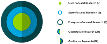
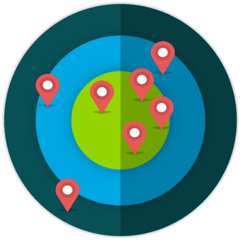
The Research Audit Target allowed the contributor to quickly, and visually, plot which areas they have already researched and which areas are lacking information.
The target moves out as the research becomes higher scope, moving from the individual user, to the specific store, to the general ecosystem the store exists in. The target is also split into left and right hemispheres, to emphasize the importance of including both quantitative and qualitative sources of research.
The benefit of this system is that it allows the designer to do as much or as little research as necessary within their time constraints. A fast paced task may only allow for one research technique in each quadrant, while a more intensive project can include multiple techniques in each section.
By the end of this process, the contributor has a clear and confident idea of the problems they need to solve moving forward.
The Problem Solving Group
The purpose of this group is to provide a safe and effective environment for exploration, innovation, and validation of outstanding solutions.
After brainstorming several solutions to the problem identified in the UX Research group, the contributor picks one solution and submits it to the Problem Solving group for critique. The group is encouraged to discuss the solution in relation to the goals of the project as opposed to offering reactive and/or directive feedback statements.
We created a google form so that the problem solving group members can rate and review a concept within a consistent context. The ratings are extracted to a google sheet, where we can see the strong and weak areas of each concept, along with specific comments in regards to the evaluation criteria.
The contributor is encouraged to meet with a developer early and frequently to discuss implementation and technical feasibility.
The Visual Design Group
This group’s objective is to evaluate, iterate and communicate visual design guidelines to balance user, client, stakeholder, business and technical requirements while ensuring the concept is brought forward to its full visual potential.
The Visual Design group functioned in a similar, but less formal, approach to the Problem Solving group. We started this group by requiring mandatory revisions from peers, and peer sign off. As a result of the recurring group retrospectives, we eliminated the mandatory revisions and approvals, and placed all final decisions in the contributor's hands with the caveat that they must be able to justify their design decisions. This was a very powerful change, because it gave the designers ownership and accountability to make appropriate revisions based on how they interpreted the feedback.
The design team at Granify used (and loved!) a relatively new design software called Figma, a real-time collaborative tool which can be accessed in browser or through a desktop application, making it extremely easy to share work with non-designers.
The Results
The CEO was very impressed with the amount of time and thought I had put into this project. By setting up recurring retrospectives for each group, they were able to quickly address pain points and implement new or different procedures to accommodate. I invited the CEO to the retrospectives, so that he could offer insight from his perspective, and ultimately ensure that the groups were aligned with his vision.
We also noticed a significant increase in the designer’s engagement and overall happiness. The system also helped us innovate new concepts and completely redefine old, "proven" concepts. The process as a whole had a tremendous impact on the company, and the results had exceeded both the CEO’s and my own expectations.


